I have been searching for peace and eternal beauty for many years.
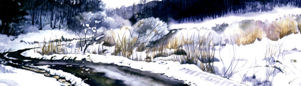
The last winter I felt the world is getting harder and heavier.
I asked myself how I could get a better life.
Align to your good feeling and manifest.
How I can get good feeling?
Make yourself happy.
What is happiness?
Where happy comes from?
Paint it.
So I painted “Opening of Happinessâ€.
After I painted two big happy colors Hibiscus at dawn. And my brash stopped. I need something. But I couldn’t figure, so I fooled around a couple days.
My friend photographer Ron/www.levalleyphoto.com sends us his photo every morning. Actually he sends around two am. I wonder when he sleeps.
He is a bird lover including all kind of nature. One of his birds attracted me. Just fit in my between two hibiscus. So I painted the bird and one four leaves clover, because The Noah Boat story flashed in my mind.
Yes, small Hope opens Happiness.
Then “Opening of Happiness†is done.
I found that Japanese Green Energy technology is ready to switch over nuclear energy plants. Leaking of radioactive is threatening us. But moneymakers don’t let them change to Green Energy.
Then my friend in San Diego received this letter from her friend in Australia.. This letter traveled all over the world and came to me:
Date: March 14, 2011 7:23:04 AM HST
From my cousin in Sendai, Japan where she has lived for the past decade teaching English. Very moving!!
Hello My Lovely Family and Friends,
First I want to thank you so very much for your concern for me. I am very touched. I also wish to apologize for a generic message to you all. But it seems the best way at the moment to get my message to you.
Things here in Sendai have been rather surreal. But I am very blessed to have wonderful friends who are helping me a lot. Since my shack is even more worthy of that name, I am now staying at a friend’s home. We share supplies like water, food and a kerosene heater. We sleep lined up in one room, eat by candlelight, share stories. It is warm, friendly, and beautiful.
During the day we help each other clean up the mess in our homes. People sit in their cars, looking at news on their navigation screens, or line up to get drinking water when a source is open. If someone has water running in their home, they put out sign so people can come to fill up their jugs and buckets.
Utterly amazingly where I am there has been no looting, no pushing in lines. People leave their front door open, as it is safer when an earthquake strikes. People keep saying, “Oh, this is how it used to be in the old days when everyone helped one another.”
Quakes keep coming. Last night they struck about every 15 minutes. Sirens are constant and helicopters pass overhead often.
We got water for a few hours in our homes last night, and now it is for half a day. Electricity came on this afternoon. Gas has not yet come on. But all of this is by area. Some people have these things, others do not.
No one has washed for several days. We feel grubby, but there are so much more important concerns than that for us now. I love this peeling away of non-essentials. Living fully on the level of instinct, of intuition, of caring, of what is needed for survival, not just of me, but of the entire group.
There are strange parallel universes happening. Houses a mess in some places, yet then a house with futons or laundry out drying in the sun.
People lining up for water and food, and yet a few people out walking their dogs. All happening at the same time.
Other unexpected touches of beauty are first, the silence at night. No cars. No one out on the streets. And the heavens at night are scattered with stars. I usually can see about two, but now the whole sky is filled.
The mountains are Sendai are solid and with the crisp air we can see them silhouetted against the sky magnificently.
And the Japanese themselves are so wonderful. I come back to my shack to check on it each day, now to send this e-mail since the electricity is on, and I find food and water left in my entranceway. I have no idea from whom, but it is there. Old men in green hats go from door to door checking to see if everyone is OK. People talk to complete strangers asking if they need help. I see no signs of fear. Resignation, yes, but fear or panic, no.
They tell us we can expect aftershocks, and even other major quakes, for another month or more. And we are getting constant tremors, rolls, shaking, rumbling. I am blessed in that I live in a part of Sendai that is a bit elevated, a bit more solid than other parts. So, so far this area is better off than others. Last night my friend’s husband came in from the country, bringing food and water. Blessed again.
Somehow at this time I realize from direct experience that there is indeed an enormous Cosmic evolutionary step that is occurring all over the world right at this moment. And somehow as I experience the events happening now in Japan, I can feel my heart opening very wide. My brother asked me if I felt so small because of all that is happening. I don’t. Rather, I feel as part of something happening that much larger than myself. This wave of birthing (worldwide) is hard, and yet magnificent.
Thank you again for your care and Love of me,
With Love in return, to you all,
What a beautiful, strong, intelligent person’s letter is.
The painting “Opening of Happiness†is in the show “”Birds of a Feather”
The show runs from April 4 to May 1, 2011
Reception: April 17th from 3pm
At The LJAA Gallery
8100 Paseo del Ocaso, Suite B
La Jolla, CA 92037
(858) 459-1196  Open daily 11 – 5
You are invited. I will be at the reception. I hope to see you there.


")


